Presentation: “Beyond WCAG Compliance: Next Steps in your website’s commitment to digital inclusion”, WordPress Accessibility Meetup
Presenters: Andrew Mallis and Mike McCaffrey, Kalamuna
Today I attended a meetup that I thought was worth taking notes on to share here.
I took down a lot of things they said and copied text out of their slides where possible—for better accessibility!—using the extremely useful Text Extractor function in Windows PowerToys. I also added a few notes of my own, particularly about the tools I use in WordPress to help editors make accessible decisions. I’ve tried to clean things up and add links where possible, but they are still notes, so pardon any typos or other small things. Feel free to bother me about them in the comments or ask any clarifying questions.
If you read nothing else, know that…
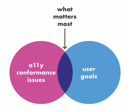
Usability is what matters
Don’t do accessibility for fear of legal compliance. “Approach it with humans in mind!”
Compliance does not guarantee usability! Meeting the guidelines doesn’t mean that people can use your site! No agency can truly guarantee compliance:
- A website update could introduce a new accessibility bug
- Content editors could introduce accessibility issues
What matters most is meeting the WCAG guidelines to enable them to use the site!
Auditing & Remediation
Types of Analysis
Automated scanning
Lots of ways to do this with browser extensions like WAVE toolbar and axe DevTools. (I also tend to look at the Firefox Accessibility DevTools which have an awesome contrast tester, the Google Lighthouse tool checks, and the sa11y and ANDI bookmarklets when I need quick reviews of a few things.)
These are good for identifying issues that appear on every page (header, menu, footer). These tools however can identify too many issues sometimes (example: contrast problems for visually hidden text only for screen readers).
There are also site-wide scanning tools like SiteImprove and Dyno(?). They can be really good for identifying content issues and identify improvement over time. However, they can be very expensive. They often give you a score that can be motivating to improve, but that score isn’t a perfect analog for usability.
Limitations of automated scanning issues:
- Tools flag different issues
- Only 30-60% of issue can be tested automatically
- Time-intensive checklists required to review
- Takes lots of effort to make the warnings go away
- Compliance does not ensure usability!
User Testing (People, not Robots!)
How to do this:
- Determine high priority user stories / journeys – It’s important to focus because testing can be time-intensive and expensive)
- Have real people try to do the tasks
- Find people who use accessibility tools regularly (lived experience)
- Get detailed feedback on how easy/difficult tasks were to complete
Some places to find users for testing:
You may be able to find volunteers to help with testing, but always be sure to compensate people doing this important and difficult work.
Usability (Heuristic) Analysis
In this method, you have a few experts review a site and evaluate it based on commonly accepted usability best practices. Heuristic evaluations were first proposed by Jakob Nielsen, a long-time usability expert. For example, contrast and text size are important because it helps people engage with information. (These overlap with WCAG guidelines.)
This can miss things, but can cover a broader range of features faster and cheaper than a comprehensive scan.
Heuristics that Kalamuna reviews:
- Visual Perception
- Mouse Navigation
- Keyboard Navigation
- Mobile Navigation
- Screen Reader Navigation
- Voice Navigation
- Robustness (what happens when JavaScript fails?)
- Cognitive Considerations
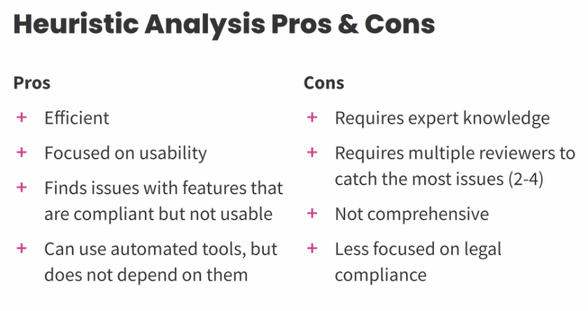
Pros
- Efficient
- Focused on usability
- Finds issues with features that are compliant but not usable
- Can use automated tools, but does not depend on them
Cons
- Requires expert knowledge
- Requires multiple reviewers to catch the most issues (2-4)
- Not comprehensive
- Less focused on legal compliance
You can do some testing yourself!
- TAB through your page to see if you can use a keyboard
- Try out a screen reader like VoiceOver on MacOS/iOS and NVDA on Windows
I’m a huge fan of people learning to do some basic accessibility testing themselves, and I’ll be presenting a workshop on this topic at the Nonprofit Technology Conference in Portland in March 2024.
Prioritization
There will always be new issues to uncover and improve. (Isn’t this true for everything!?)
It’s important to focus on roadblocks over technical correctness. Quick wins can often lead to large results.
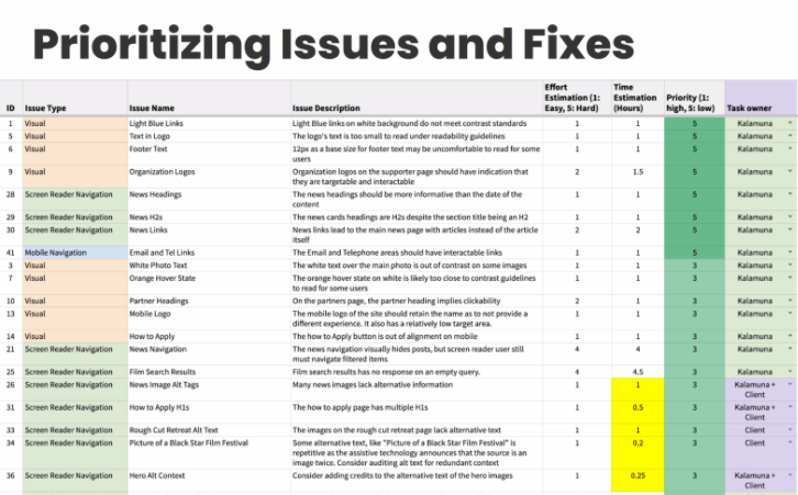
Common high-priority issues
Many of these issues can completely prevent someone from engaging with some or all of your site content or features.
- Keyboard focus visibility / traps
- Site navigation1
- “Mobile” navigation does not work on small desktop screens
- Missing HTML regions for screen reader users
- Poor heading structure for screenreader users
- Pop-ups and banners that don’t work
- Text in images (Even when you have alt text, this often is less accessible than real text!)
Fixing Things
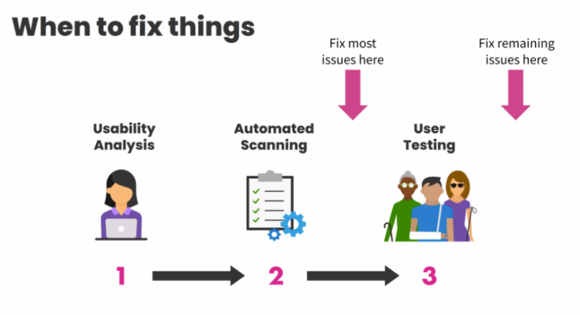
I take the same approach for the same reason: You don’t want to ask valuable testers to tell you about things you already know or get frustrated with really obvious issues.
Building with Accessibility in Mind
Define a criteria you want to meet from the start and include usability thinking from the start. (It is so much cheaper and easier to integrate accessibility rather than retrofit it onto something later!)
It’s very helpful to have a designer that understands accessibility beyond color contrast, so they can consider things like hover states, the order of keyboard navigation, clear headings, and the need for good labels in links, buttons, and forms.
Helping Content Editors
I see that Kalamuna does a lot of things I do on my own sites to try to help editors make accessible content decisions from the start.
- Restrict the heading levels you can insert on the page (No Heading 1).
- Ability to hide headings that are accessible to screen readers
- Insert images only from the media library (where alt text is managed)
- Focus on plain language writing (Hemingway is a good tool for this)
- Focus on inclusive language
- Flag PDFs that are inaccessible
- Use style guides for alt text and plain writing
- Use manual translation whenever you can.
I happily have a lot of tools and plugins I use to provide these features on all sites I build!
- I use my own MRW Simplified Editor and Useful Block Styles plugins to limit heading levels, increase the prominence of contrast errors, route users to the Media Library, and let editors hide headings that should only be exposed to screen readers.
- Editoria11y flags PDFs, bad link text, images without alt text, and a number of other really helpful checks that are specifically designed for content editors.
- Yoast SEO can offer reading level and inclusive language checks along with other plain language recommendations.
- I’m also exploring a standardized way to blur images without alt text for logged-in site editors so they get the same experience of using the site as someone who can’t see the image.
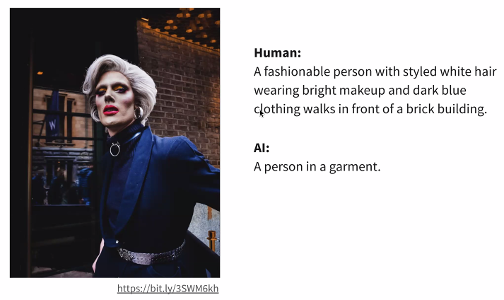
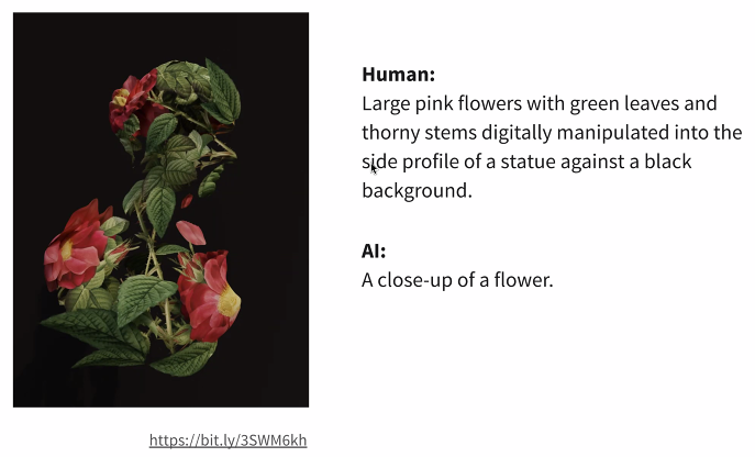
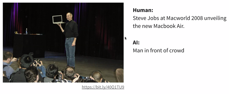
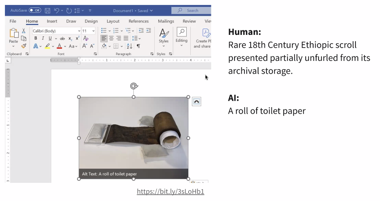
Artificial Intelligence for Alt Text
Doesn’t work.
- No emotion.
- Doesn’t consider context of the pages.
This was a great meetup and I’m glad I attended. Andrew and Mike both shared a lot of valuable knowledge, and I’ll definitely be incorporating a few ideas they shared to tweak how I approach my own accessibility reviews and fixes.
- Important reminder that “mobile navigation” isn’t just used on phones. For instance people zooming the browser in see that, so “mobile menus” need to support keyboard interactions! ↩︎